Prototypes
Making prototypes that are good enough to play-test with, but not so fancy that it’s expensive to upgrade them, is a delicate balancing act. I am often envious of my counterparts in more populous regions who have access to cheap, quick, and easy ways to print and see their designs. With international postage and currency conversion fees added on top, these option have rapidly become luxuries that I can’t justify.
We printed the first prototype for Any Other Name on my misbehaving laser printer, which seems to have a terrible time with anything using magenta or to a lesser extent, yellow. It’s disappointing not to see the real colour combinations, but it’s also not worth paying through the nose for professional printing at this stage. My printer has also stopped accepting heavier GSM paper, so we played with standard-weight, disappointment-coloured pieces of poorly-cut paper. Hubby is currently out of action with a broken hand, so the bad cutting was the fault of my impatience, but it somehow added to the overall grumpiness of the process.


Despite my overall irritation with my sub-optimal prototyping skills, the game itself actually played well enough that it surprised George, who had not expected to like it. I had a great time, and the scores were much narrower than expected.
Posy tiles
A major obstacle for me, initially, was how to design an appropriate Posy Board so that the “bingo” experience was there, but that it still had both replayability and upgradeability. I decided to try making it modular, instead, with allows for both adding in expansions, and for adding difficulty by making the grid larger. It’s mildly more expensive at the small scale than a simple player mat, but the advantages massively outweigh the issues. As you can now flip tiles instead of using markers, it also removes the need for another set of components, and simplifies gameplay. I am pretty pleased with this solution.
For this version, I printed a set of 18 draft posy tiles for each of us, 4 in total (so we can play the full 4-player version in other testing sessions). I used my reference photos for the two images that I hadn’t finished drawing.

Card and tile backs
So that we could differentiate between each pack, I used one of my Copper Catkin rose fabric designs, which comes in several different colourways (although you could have fooled my printer, lol). These are the ones I selected to use for this test – the red for the Forbidden Card backs, the turquoise for the Flower Cards, and the other four for the tile backs.


Forbidden Word cards
When I figured out that the forbidden words should be on separate cards, it was the final breakthrough – after that I was ready for testing.
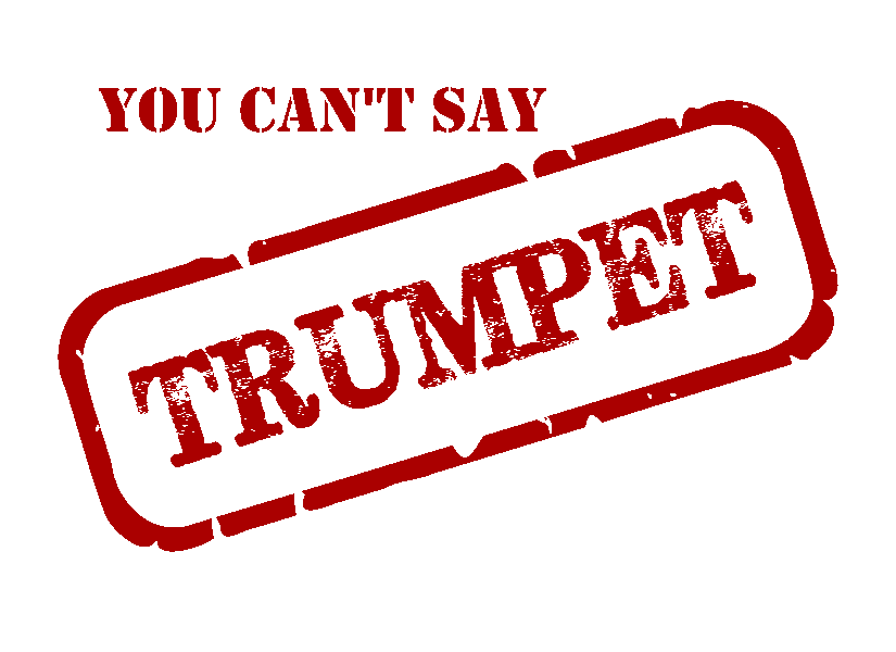
I was pretty stoked with my layout idea for the Forbidden Word cards – I made a “rubber stamp” outline in Inkscape using this helpful tutorial, and used a free-for-personal-use font called Subway Novella that looks like an ink stamp. I love the effect! I will of course need to buy the license for whichever fonts we use in the final version, but this is a great mock-up in the meantime.

It’s actually surprising how many people said “trumpet” in the crowd-sourcing I did for my forbidden words. It will be interesting to see if any other words come up all the time – I found the one I kept getting pinged for using was “flower”, so I was very much hoist by my own petard there!
Flower cards
The Flower cards are obviously the main part of the game – but how to make them both informative and legible? I toyed with cramming them full of information, but that was never going to work. I spent a few hours trying to make them fit into the format of a vintage seed packet, but dismissed it as over-used and predictable. So, how to lay them out, and what to include?


For the play-test, I simply included the image and the name(s). Turns out, that was plenty – even after we added the rule that you can’t repeat any previously-used clues in the same game. George, who knows very little about flowers and doesn’t play charades or other games of this type, initially struggled with the concept, but was quickly finding ways to allude to shared experiences, movies, and other ways to give clues without re-using them. It was excellent brain gymnastics, especially once we got into the third round, and all the Forbidden words were out.
Other elements, like the rose garden, rose tiles, and a possible player mat, I left out of this test until we had a clearer idea of what was needed. I rather like the idea of using a postage stamp layout for the rose tiles, though. Perhaps they can even have a points value (of 1) on them where the currency value would usually be displayed…


I quickly mocked up my Golden Celebration image as a stamp, and I rather like it! Let’s see if that concept stays in play…
3 responses to “Any Other Name – the draft components”
[…] prototype of the game last weekend, at last, and it stood up remarkably well, especially given the printing issues we […]
[…] I mentioned in my post about the draft components, the Flower cards are both the most important and the most difficult design element of Any Other […]
When I’m playtesting with cards I just print on to normal paper then use card sleeves with just a normal playing card behind the printed card to give it the sturdiness of a normal card. Cheap and easy for prototypes.