Card Prototypes
As I mentioned in my post about the draft components, the Flower cards are both the most important and the most difficult design element of Any Other Name. At the absolute core of the game is the ability to describe them well enough that others can guess what they are. So, how do we give people the tools to do that?
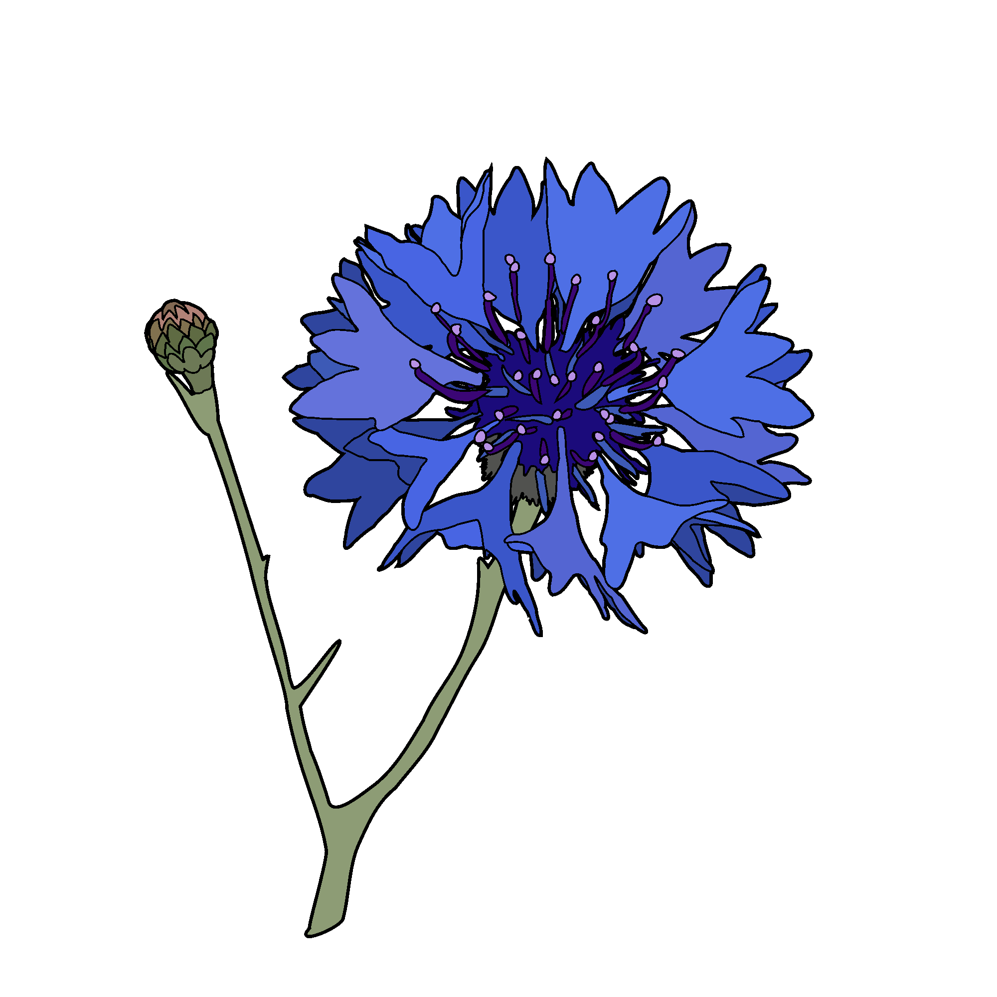
The artwork
Obviously, the first thing people will do when describing something on a card is talk about what it looks like. They can’t smell it, they can’t feel its texture or scale compared to other items. Players need information that they can assimilate and use quickly – so the images need to be clear, and any other information needs to add to that clarity, not crowd the space.


So once we have an image of the flower, what do we need next? I asked a lot of different groups, and the main things people want to know are:
- what size is it?
- does it come in other colours?
- perennation: is it perennial/biennial/annual?
Size
There are several ways to address this. The most obvious is to simply write the measurements, but without a comparison, how do people know if this is large or small, and how big the flowers are in relation to the plant?
Another option is to scale all of the flower illustrations in relation to each other, but of course, that means that some will be so small and some so large that they don’t all fit into the the same sized frame.
The same applies when using something for scale, such as the banana which is currently en vogue in the secondhand shopping groups on Facebook – in some cases, the banana is so much larger that it’s almost out of frame, and in others, it’s so much small that it’s not going to be easily spotted.

Perhaps a silhouette similar to those used to compare animals to humans is in order?

Colours
I have decided to address the range of colours available by creating a simple matrix of colour swatch circles, like you would see on a shopping site where an item is available in more than one shade. I will standardise the colours and use it to show overall colour families, rather than specifically show every single shade in which a flower can be found (because, no). I also have adopted the “rainbow” option for multicoloured flowers. It was fun to use my latest lessons in Affinity Photo to make my very first gradient – in Inkscape!

Perennation
My first step was to Google “perennial” + “symbol”, because if there is already a botanical standard, it would be silly not to use it. I was not disappointed! Carl Linnaeus, the “father of modern taxonomy”, created the Species Plantarum in 1753, which was “the first botanical work to consistently apply the binomial nomenclature system of naming to any large group of organisms”. Linnaeus is also credited as the first to use astrological symbols in biology, which were a useful visual shorthand. He used the symbol for the sun, ☉, to represent annuals, and the symbol for Jupiter, ♃, which is also shown rotated 90 degrees clockwise, to represent perennials. Biennials are represented by a “sun” symbol with two dots in the centre. These have become the traditional symbols used for these types of plants.
Fonts
Digital botanical artist Niki Simpson has come up with further symbols which could be of use, particularly when dealing with flowering plants. She has even developed a font, Simpson Botany Symbols OpenType font. I have contacted her and asked for permission to use them in the game. I think it would be nice to have that connection reaching all the way back to the first botanical classifications, and forward into the digital future.
As for the heading and text, I am tempted to use a typewriter font, but again, that’s probably been done to death, and I should just use a nice, clean, sans serif.

Let’s see how it all comes together!
You must be logged in to post a comment.