
From the very initial concept of the game, Intertidal Survival was meant to have a physical resemblance to a rockpool.
My first idea was large, transparent squares, overlaid to gradually form a top-down view into a pool. I quickly realised that logistically, this as a bit of a pain to build, and also hard to make sure each game felt fresh and new every play – the layers still need to tell a rockpool story, so some of them have to be at the bottom, or they will block the others.
Added to that, I didn’t have much knowledge of the intertidal regions, and eventually, I shelved the idea.
Fast-forward a couple of years, and I have the idea for Intertidal germinating once more. I have been a member of several Oregon coast tidepooling and beachcombing groups for a while, and now that we are actually in the Pacific Northwest at last, why not break out the old “rockpool game” idea and rework it?
I needed context, though. What are American coastal tidepools like? What lives there? How populated are they? Well, compared to what I knew in New Zealand, they were like New York city compared to a small town in rural wherever! I had no idea they could be so FULL of life!
After we were lucky enough to receive an illuminating tidepool tour from the Cape Perpetua Collaborative, I could really settle down to work.
First, I did a lot of research – what creatures will make good characters for players? How do they move? What do they eat? What threatens them? What else is present in a tidepool that needs to be included? How can I incorporate all of these things into a strategy game?


I eventually chose:
- Coralline Sculpin – Artedius corallinus
- Purple Shore Crab – Hemigrapsus nudus
- Katy’s Chiton – Katharina tunicata
- Red Sea Urchin – Mesocentrotus franciscanus
- Rockweed Isopod – Pentidotea wosnesenskii
- Opalescent nudibranch – Hermissenda crassicornis


Once I had illustrated them and their Threats and Benefits, I looked into how to represent the rising tide. I knew that I wanted the water to bring the benefits and challenges with it, so I started off using transparent cards.


I built the first prototype out of paper, as proof of concept for the movement tiles, but to truly understand how the overlapping was going to work, I needed the transparency, and overall, it worked pretty well. I knew we were onto a good thing, we just had to capture that experience.


By this time, I have symbols for all the food and threat types, and I have come up with the theme of Worms for the movement tiles. Almost all the creatures of the intertidal will chase a worm, and the worms themselves are really fascinating, if often-overlooked.
We have a clear idea of the way the game will play, with Energy (from Benefits, i.e. food), Experience (from evading and avoiding Threats), and Expertise (from building knowledge about the other tidepool denizens) as the scoring points on your Player Board.


The basic Player Boards have evolved somewhat, too, although we haven’t set scoring values yet. In principle, the prototype works and we are making excellent progress.
Killing my Darlings
The problem with transparent cards is that, well, they are transparent.


I wanted them to overlap, so that new things covered the old as the tide came in, adding a sense of urgency to the process – “get to that before it’s gone”! I feel like life in the intertidal zone is a lot like that – choose whether to stay safely sheltered, or take a huge risk for what might be a small return.
Once the water is back, the risk from humans, birds, and the sun is reduced – now, the risk comes from the sea – bigger water-bourne predators, and the sea itself, with violent waves smashing you against the very same rocks that were sheltering you only a few minutes ago.

The water, then, is important – but so is legibility. I couldn’t even get good photos of the transparent cards, let alone play, confident that I could recognise which icon was on top at what time when they overlapped – the transparency was too transparent.


I had to either make each square with an icon on it opaque, which would look awful, or find another way.
It was time to rethink my approach.
I decided to try bigger, transparent acrylic tiles with fewer icons on them – instead of 3×4 spaces with up to 5 icons per card, I made 2×2 tiles with up to 4 icons per Tide tile. I designed them, but wasn’t completely happy with the idea.
I thought that making the icons larger would probably solve the legibility issue as long as they clearly and completely overlapped each other, but it didn’t solve another problem we encountered in testing:
Gathering resources
When we tested the version with the transparent cards, we had trouble actually reaching any beneficial food resources to make any real headway against the Threats – with only a few Worm tiles per round, we couldn’t get to the squares we wanted to visit in time.
I decided that I wanted to have “Zones” on the board. If an icon is in a particular Zone, anyone who lands on any part of that Zone has access to it. Yes, that works – but you still can’t really see the icons, whether the cards are poker-shaped or square… and the shapes on the board contribute to the legibility issues with the transparent tiles.


Then it hit me. Put the shapes on the TILES, not on the board! Make two types of square tile, with the shapes on them, and lay them contiguously as you go – now you can create Zones as you lay the tiles. We can work on transparency later – for now, we have something that works!


With regards to the colours I am using, they are arbitrary colours that I personally enjoy, but they will not be the final form. We need to make allowances for different requirements, walking the fin line between making it possible for colourblind people to distinguish between the different shades by using pattern, and overwhelming people who have a lower tolerance for stimuli with too many patterns, which we encountered when testing Ladybird Logic at Protospiel Online.

One thing I loved about the overlapping was the pressure to get things before the tide basically took them away. With opaque tiles, that still potentially works if we overlap them – and it takes up less space on the table – so we are going to test that option as well.
The incoming tide
In the previous versions of Intertidal Survival, we played a set number of rounds then all the cards for that tide get dealt out. In this version, I decided to trial having players lay the tide tiles where they like, as long as it connects to an existing tile – think Akrotiri and other tile-laying games, or video games like Command and Conquer, where you can only see the world you have explored on your map.


In this case, you can only move where the water reaches, and as with any place where water goes, it chooses its own path. I think having the players bringing the tide in throughout the game gives a more realistic sense of the incoming tide, and more agency about where and how different threats and benefits appear.
As they currently stand, the rules we are testing ask players to select three Tide tiles at the end of their turn, and spend their downtime deciding which one to play first, how to move, and then where to put the other two.


Player interaction also comes from laying Tide tiles near your opponents – when a tile with the same colour is laid next to yours, the Zones combine. If there are benefits in the Zone, you collect them immediately, increasing your Energy score accordingly. If there is a Threat to you in the Zone, resolve that at the start of your turn, before you lay your first tile.


Because Threats cost a toll in Energy to escape, you can really affect an opponent if you place tiles next to them that mean they have to face one or more Threats immediately – so with every tile you place, you have to choose whether to inconvenience your opponent, or benefit yourself. As the water rises and the placement choices reduce, the tension rises, too.
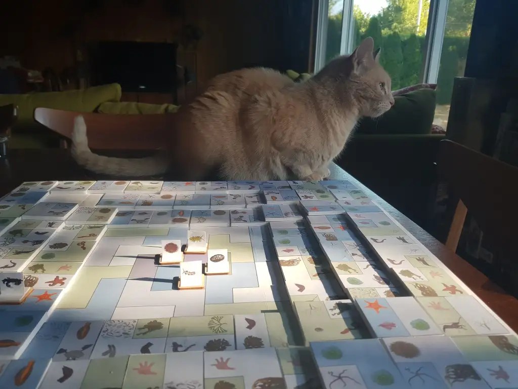
So here’s our current prototype, with the rising tiers of tiles representing the incoming water, which can spread at the will of the players to a certain extent. If we overlap them, then players are also choosing to block access to some resources (or threats) for the rest of the game. That’s probably the version we will choose – it will play faster and we expect it will also feel tighter.


This is a comparison between the first option, no overlap, and the second, with overlap.


And here is Loki, descending upon the game as if they really are small creatures in a pond, and he is the greatest of all Threats – a cat on a gaming table. Best viewed with the sound on, for added silliness.
Bonus Loki pictures for reading this far – thank you!

If you are in the Intertidal Survival Facebook group, you will have seen me post about this process, with a rough outline of the rules as they currently stand. I plan to expand on that outline with a full blog post once we have hammered out the rules and functionality for the game – hopefully within the next week or so!
You must be logged in to post a comment.